Showing posts with label Observation. Show all posts

Friday, April 26, 2013

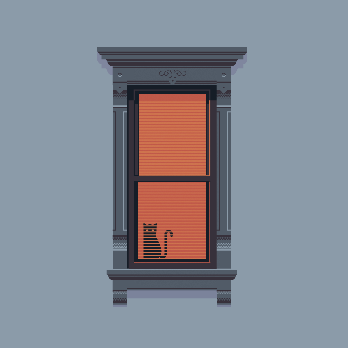
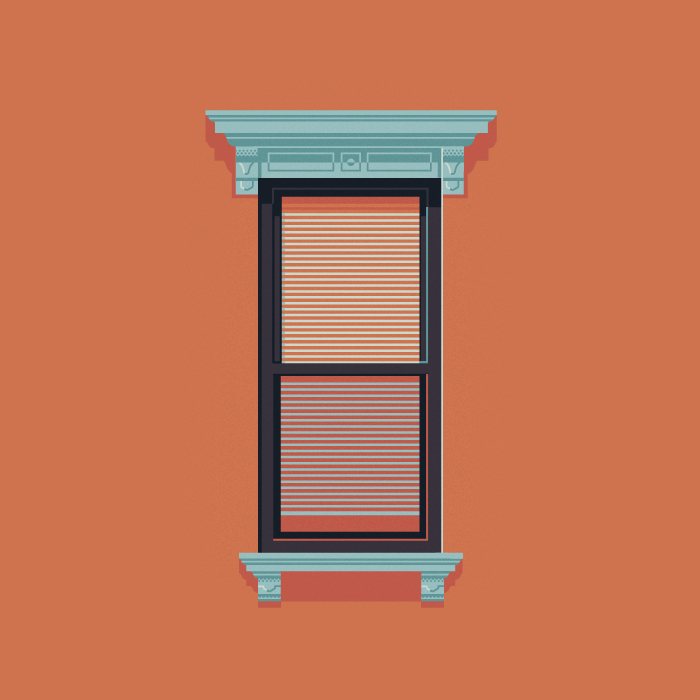
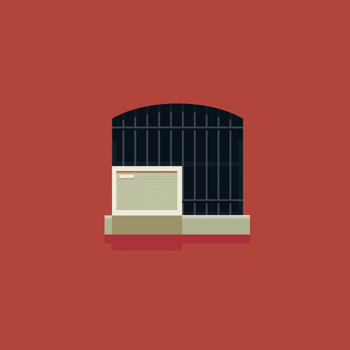
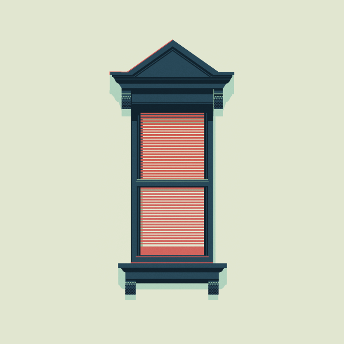
Windows of New York


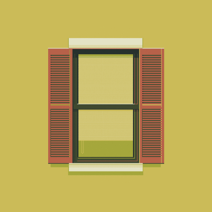
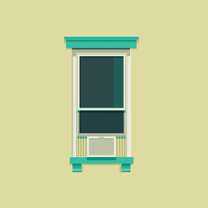
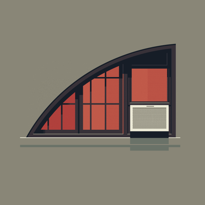
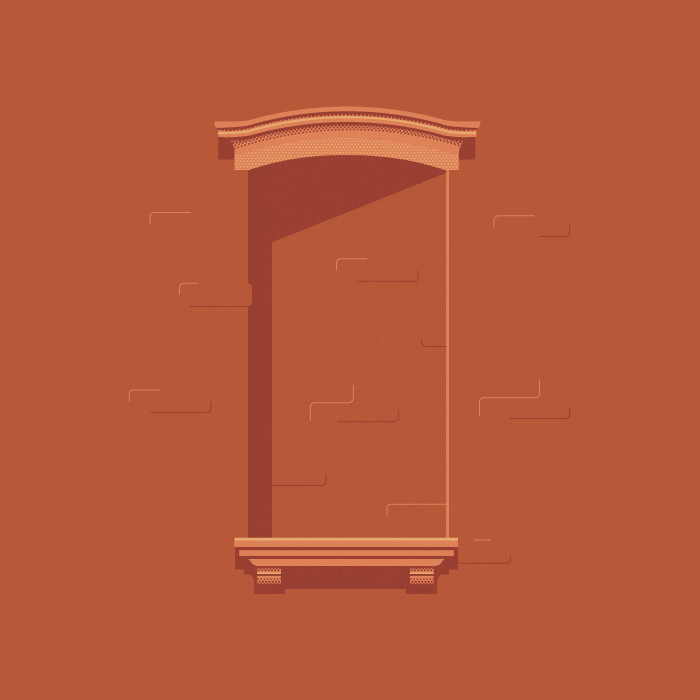
Windows of New York is a fantastically elegant collection of illustrated windows observed by New Yorker and graphic designer, José Guizar. José challenges himself to "never stop looking up" in the crowded city by updating the ever-growing series each week with a new window. I love how clean and simple the lines and shapes are while still communicating such great detail. Below are a few of my favorites so far.


Friday, November 4, 2011

Image: Mondo Posters

The Bride of Frankenstein
Mondo Tees gets a lot of poster commissions for films being re-released into theaters. It's no wonder why. Their work is awesome. The illustrations include imagery that immediately gives the feel of the film that also brings about a strong sense of nostalgia. I highly recommend browsing their gallery.

Return of the Jedi

The Invisible Man

The Iron Giant

Rocky
The Saul Bass-like minimalist design for this Rocky poster is absolutely brilliant. Just putting that out there.

A Nightmare on Elm Street

(via Mondo)

Tuesday, November 1, 2011

Hierarchy: Posters

Here are a couple of fantastic posters I found that make use of strong hierarchy.

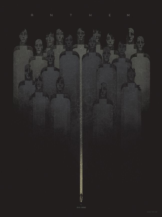
Ayn Rand's "Anthem" by Kevin Tong

The first is a print based on the Ayn Rand novella Anthem. The story takes place in a dystopia where individualism is erased from society (using the word "I" is a capital offense). The imagery here sets up the mood perfectly, having the emotionless group taking up most of the poster's upper space while the lone individual stands at the bottom, almost a speck in comparison. The title takes prominence (perhaps just after the crowd image) at the top while Rand's name (that of an individual, keeping with the theme) is minuscule at the very bottom of the hierarchy. 

Iron & White spring tour by DKNG Studios

This music tour poster makes what is most important very prominent, like the center of a bullseye. Secondary information becomes part of the radiating-from-center image, making your eye travel outward, taking in more and more until it finds the passing train at the bottom.

&

Sunday, October 23, 2011

Scale: Giant Sculptures


It must be very impressive (and possibly intimidating) to stand in front of these sculptures of objects and people in larger-than-life scales. I think their largeness is exaggerated further by the fact that each of the sculptures are modeled after subjects that viewers recognize and are used to seeing at a certain, smaller scale.


Tuesday, October 18, 2011

Conceptual Earthscraper


These are some designs and models of a conceptual earthscraper, an upside-down skyscraper. Its purpose is to offer additional work and living space in the center of Mexico City without hogging up the skyline. Needless to say: it's an insanely cool idea. The areas of space from top to bottom would go Aztec museum (first ten floors), retail,  apartments and then businesses. Now, the glass floor (see also: ceiling) is made to allow light from the outside to filter throughout the structure, but somehow I doubt those businesses at the bottom are getting much sunlight. I think I'll stick to living and working aboveground, thanks. The museum and retail spaces, on the other hand, do look like they'd make for a fantastic tourist attraction. For now, though, its only a concept.


Yes, the glass is designed to be walked on. Not good for those afraid of heights... or of falling the 50+ stories below. I hope its sturdy.

Sunday, October 16, 2011

Type: more from Axel Peemoeller


When I was looking at Axel Peemoeller's awesome parking garage way-finding, I noticed some more interesting work with type. Above is some cool type made from what appears to be torn paper. Below are some magazine ads for cars. They're a bit creepy as well, but I'm fascinated with how the letterforms interact with their environments.


&

Texture


Friday, October 14, 2011

Navigation: Axel Peemoeller

This way-finding design in a Melbourne parking garage clearly states where you should be going and yet, just thinking about all the thought process that went into its creation is absolutely mind-boggling.


Monday, October 10, 2011

Charles and Ray Eames

Eames Christmas card, 1946

It has become too common of a practice for people to find a very specific, narrow field and commit only to that. Charles and Ray Eames decided that if they had an interest in it, then it would become their business, regardless of what they had accomplished the day before. The couple contributed to art, design, science, furniture, architecture... the list goes on.

A project that blends science, film and design, "Powers of Ten," blows my mind, especially considering that it was made in 1968, before today's very liberal use of CGI in film. The photographs used to simulate a camera traveling from Chicago to beyond the Milky Way are patched together nearly seamlessly, allowing the film  to convey the wondrous scale of the universe in a very accessible way.

Filming during "Powers of Ten"

Charles and Ray Eames had a fantastic curiosity for the world. The interests and observations they held continuously crossed over into their work. For example, the couple had a large collection of photography that documented forms as they naturally or beautifully occurred. Finding interest in the world (or even beyond in such cases as "Powers of Ten") allowed the couple to relay the elegance of nature and observation. Below is one such observation photograph of a fence's shadow on sand. Notice the gently wafting curvature and compare it to the lines created on the chair design below.

Observational photograph from Eames "cabinet of curiosity"

La Chaise chair mold

Some of Ray's cover designs for magazine Arts & Architecture also caught my eye. It was Ray's aim to portray the magazine's avant-garde representation of art and design. She did this beautifully with these abstract forms, whether very structural or organic. The randomized repetition of figures in the last one is also fun and eye-cathcing. What I find most appealing in these covers is the presence of Ray's hand, whether through collage or pen work.


Thursday, October 6, 2011

Voice: Paula Scher

Achievement First Endeavor Middle School

Paula Scher's prominent and colorful work is inspirational. These examples of large-scale typography demand to be read and offer up-beat, humorous, and energetic messages. She really has a knack for injecting space with extraordinary energy and voice.

Achievement First Endeavor Middle School hallway

I wish my middle school had looked more like this! How could anyone walk through this building in a bad mood? With the bright, energetic colors and large-scale positive messages taking over the environment, I can only imagine that Scher's designs help boost the morales of kids in a difficult, transitory time of life. 

Queens Metropolitan Campus murals

Concept for a midtown Manhattan parking garage