Showing posts with label Project. Show all posts

Monday, December 12, 2011

Design Anatomy App

Click for interactive iPad app
The Design Anatomy app treats design as if it were the subject of an anatomical study. Themes of layering, dissecting, and diagraming continue throughout to give this effect. Since the content is more observational than informational, the app is intended for people (most likely students) who are familiar with design and its principles, but would like different perspectives and inspirations.

Scale Page
Content and graphics are positioned and designed to lead the viewer down the app's vertical layout. Flowing lines navigate through the content, starting on the launch screen and ending on the last page. Lines and images bleed from page to page, making the user curious about about the rest that cannot be seen until the next page comes up. Dotted lines also guide the user to buttons that are linked to outside websites for additional information.

Layers page
The layout is made up of a four column grid, which allows for a nice variety of options for organizing content. In cases where image is most important, the content is able to take up multiple columns, but there could still be room for text about the work (see Texture, Voice, and Craft). If pieces of content are of equal importance, the even number of columns allows for an appropriate layout (see Layers and Hierarchy).

Craft page
The typeface used is Garamond. Its form compliments the fluid elegance of the navigation lines and opening image (the Bride of Frankenstein). It also has a textbook formality that works nicely with the theme of an anatomy study. Kerning is kept tight in the titles to create fascinating shapes, connections, or fluidity among the letters. This encourages users to study the typography's interesting forms.

(Design Anatomy app)

Wednesday, November 2, 2011

The 10th Amendment

"The powers not delegated to the United States by the Constitution, nor prohibited by it to the States, are reserved to the States respectively, or to the people."

When choosing colors for this project, I wanted combinations that would be powerful, leading me to colors that contrasted or complimented each other. I ended up with a dark purple and yellow because, as compliments, they evoke energy from the way they interact. Yellow is also associated with electricity and the sun, which are both linked to power. The typeface is Rockwell, because it is structural and bold. This relates well since I imagine the 10th amendment to be a last effort of the founding fathers to install structure between powers of the federal government and powers of the states.

Extreme scale differences
In the first poster, I used the extreme scale to visualize a two-word chant like one might hear at a football game. Here is where I started to realize that the colors look like school colors and the type looks like college logo lettering. Each state has its own sports teams that compete to show who is the best (or who has the most powerful team/state). Here, the amendment takes on the role of a cheerleader or fan giving the states motivation and power of their own.

Minimal scale differences
With minimal shift in scale, I relied more heavily on repetition to convey the amendment's message. Here, the wording of the 10th Amendment makes up the United States, but the words "states" and "powers" are bolded and yellow. They stick out, making their repetition more evident to emphasize that there are multiple states within this country that each have their own rights.

Use of image
With imagery now to work with, I decided to take some very recognizable shapes and put them into a ridiculous situation. The states can read as superheroes, rockets, or jets all of which act as symbols of power. 

I think all three flyers work in different ways, but the one that is most successful is the third, image-based flyer. With images, this flyer has an extra element to help it out. It includes very recognizable shapes (states) and illustrative elements in the form of jet vapor trails. Seeing the states immediately keys the viewer in on what is the subject. This in conjunction with what the states are doing (flying, rocketing upward) makes it clear that there is a positive message related to the states having some special abilities. The highlighted words ("states" and "powers") reinforce the message as a secondary element.

Wednesday, October 26, 2011

Texture from Type

Photographed texture

Texture recreated using only type

Description of the original texture: "The soft texture is made up of many grid-like, rectangular bumps, similar to kernels of corn on the cob. Each bump is made up of dozens of small threads that create a nap to the texture. Running a hand down the nap feels smooth and velvety. Running a hand up the nap creates a little more resistance and a fuzzy surface like the coat of a short-haired dog. Then, each thread is more noticeable as they brush against skin."

In recreating the texture with only type, I used 25 layers in Illustrator. Garamond works well with its serifs occasionally reading as loose bits of thread sticking out of the fabric. The typeface's humanist strokes of subtly varying widths and angled serifs and strokes helps to portray the looseness of fabric. A sans-serif, slab-serif, or even modern typeface may have been too machined, rigid, or structured to give off the feeling of fabric.

Type has the potential to do a surprisingly large amount of what photographic images can do. It can communicate depth, texture, space, color, lighting, etc. With enough type and enough painstakingly long hours upon hours upon days upon weeks... I don't see why type couldn't finally achieve the photorealism of a photograph. The only problem is that the computer might explode before that point.

Wednesday, October 12, 2011

Environmental Design: Let it out

The location for this project is the Park Street T Station entrance/exit. This is an area that receives a lot of commuter traffic, especially from people who work or study on Beacon Hill and the surrounding area. 

Commuting, especially on public transportation, is not exactly a bright and cheerful experience. Quite often, the trip is long, crowded, uncomfortable, and filled with dread for the rapidly approaching workday. This signage is designed to help those commuters to release some of the negative energy that develops on the T before continuing on to work or school.


The first graphic the viewer comes to is the phrase THIS WAY with elongated stems reaching around the corner. This action of reaching and moving over or through the obstacles in between (an advertisement, pipes, crevices) is designed to attract the viewer's curiosity. Since the type is so large (in comparison to the signage and type nearby), it is implied that something big and important is just beyond the doorway. 


The viewer is drawn to discover what is so important that these words needed to visually reach out, grab them, and drag them around the corner.


Once on the other side of the wall, the viewer is presented with large brackets with the simple phrase "let it out." Here is where all the frustrations and anxieties developed on the T can be let loose in any way the viewer chooses (yelling, stomping, cursing, etc.). From there, viewers are free to go about their days in higher spirits and less likelihood of taking their anger out on fellow workers.

Not having color in this project forced me to rely much more heavily on type and scale to convey the message. Rather than bright, eye-catching color, the scale of THIS WAY is what is meant to catch attention along with the movement created by the traveling lines. The condensed THIS WAY was also able to evoke the tense feelings of agitated commuters, thereby connecting with their current mindsets. Once outside, the type changes. "Let it out" is in regular Futura, a more calming, elementary school-esque weight of the font with circular o's and e's. In all lower-case, its as if the phrase is being said in a soothing voice to let the viewer know it is okay to vent. This is a safe, enclosed space. Creating the space are two brackets that are immediately recognizable as containers, but are open enough at the top and bottom to not make anyone feel trapped while standing inside.

Go on. Let it out.

Wednesday, September 28, 2011

Craft Project


From a mysterious slot in the white void slides a black ball. After that, another and another until there is a continuous appearance of the dark objects falling swiftly to the ground. Upon impact, each ball will shatter into hundreds of smaller balls, most of which will collect at the bottom of the space. Only a few will break away and be flung high enough to reach the top.

In choosing between lines and points as my medium, I decided to go with what I thought could communicate more weight. Sure, a line could have fallen and then broken into a lot of little lines in my story, but the ball shape allowed for the breaking point to be much more explosive. The pieces could fly, bounce, and roll every which way. I didn't think a line could communicate that as effectively.

The photographs have made the story much more dramatic. The first photo, being out-of-focus, makes the origin of the circles mysterious. Bright lighting on certain parts of the box create a great contrast to the dark shadows, making the story more intense. Intensity is also added by angles that are never straight-on views. The balls are falling to their demise. But, in the fifth panel, the small pieces fly up into brightness. The last photo shows a few of those pieces in another out-of-focus shot, suggesting that they are now in an ethereal, possibly happy state.

Sunday, September 25, 2011

Emotion Grid: Relief

The emotion I chose to illustrate was relief. The colors involved in this story are blue (blue-green spectrum), red, and black. I think of relief as being like a wave. It sweeps over you and washes away any feelings of despair or anxiety. Here, the calming, cool blues and greens are the relief rushing in to overcome the darkness and twinges of discomfort represented by accents of red. 


In the planning stages of this project, the design was more chaotic with colors that didn't necessarily relate to one another. That element of contrast still exists in the final product with the bright blues directly battling the dark blacks. The difference is that now, the blue/green colors act together more cohesively as one moving force that evolves from one part of the plane to the other. The hues of the cool colors become brighter and more intense as they move from the bottom left toward the top right to show a growing strength in the emotion that it will need to overcome the negative feelings.


Language and type gave the color story additional meaning due to the contextual nature of words and letterforms. Words have meaning behind them and evoke emotions from the reader, whether consciously or not. Words like hope, cascading, and rebirth have light and refreshing conations that are necessary to convey relief. Likewise, typefaces are also able to communicate through their forms. I chose Optima to help me display relief because, as a humanist typeface, it is has an organic feel. The strokes do not looked machined and vary, calling to mind the way a person might write with ink. This organic flow within the letterforms aided the look of a naturally cascading and evolving form.

Through both parts of the project, grid played a huge role. In part 1, it required me to think about the placement of images very carefully. Relationships between images were completely different depending on where they were placed. The grid played an even bigger role in part 2, even though the appearance of the grid is much subtler here. I was able to place certain letterforms in the correct places and get just the right accents of color by referencing the first image grid. This also showed me where the meeting of the blue and black forms was so that I could communicate it in the type grid. Due to the open spaces between the words and letters, that meeting place was translated into white space to act as a more defined area.

Tuesday, September 13, 2011

Color Study

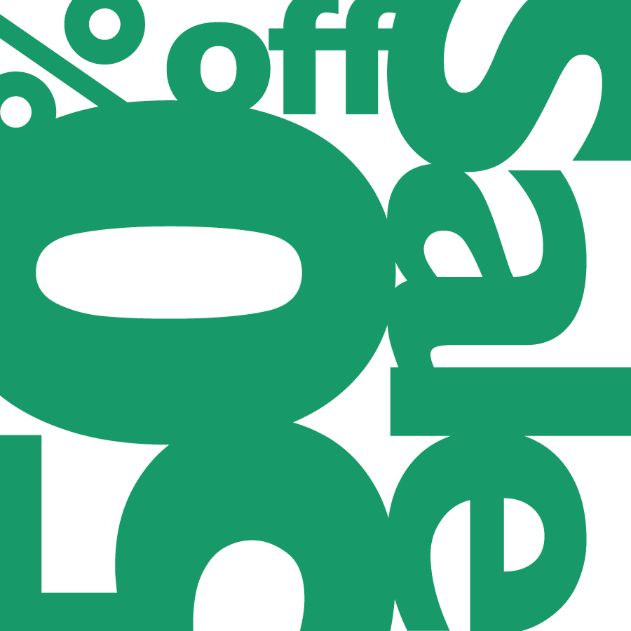
Sea Foam Green

Pine Green

Olive Green

Emerald Green and Brick Red

Jungle Green and Mint Green

Easter Grass Aqua and Sherbet Pink

Wicked Witch Green, Moss Green and Asparagus Green

Plastic X-mas Tree Green, Stop Sign Red and Caution Yellow

Dark Forest Green, Tic Tac Orange and Steely Green

I chose green as my main focus for this assignment. I've always thought of green as a cool, calming color. It is often associated with nature and the environment. This relation became especially apparent when I looked at all the shades of green and kept thinking of different leafy plants, trees, and vegetables.

With such a strong connection to nature, I noticed the different greens evoking the feeling of different seasons. The first panel of Sea Foam Green makes me think of vibrant new life in plants or the ocean, making the ad look like its for either a Spring or Summer sale. The olive green looks more like a leaf getting ready to turn yellow or orange, appropriate for Autumn. Emerald Green and Brick Red together may make the viewer think of Christmas and the Aqua and Pink may be for Easter/Spring.

Figure/Ground was most notably triggered by colors of similar value, as seen in the Aqua and Pink ad. Those colors next to each other make for a strong vibration that makes the eye question which shapes are negative and which are positive. This also occurs for the Red, Green, Yellow and White ad between the Red and Green. In that same ad, there is also noticeable figure/ground around the word "Sale" due to the darker primary colors contrasting the lighter white.

As the color combinations became increasingly more complex, it became easier to identify what kind of ad each one could be. The associations with things like Spring, Christmas, Back-to-School and Clothing became clearer when there were more colors present. Other factors included how much of certain colors was used and the shades of those colors.