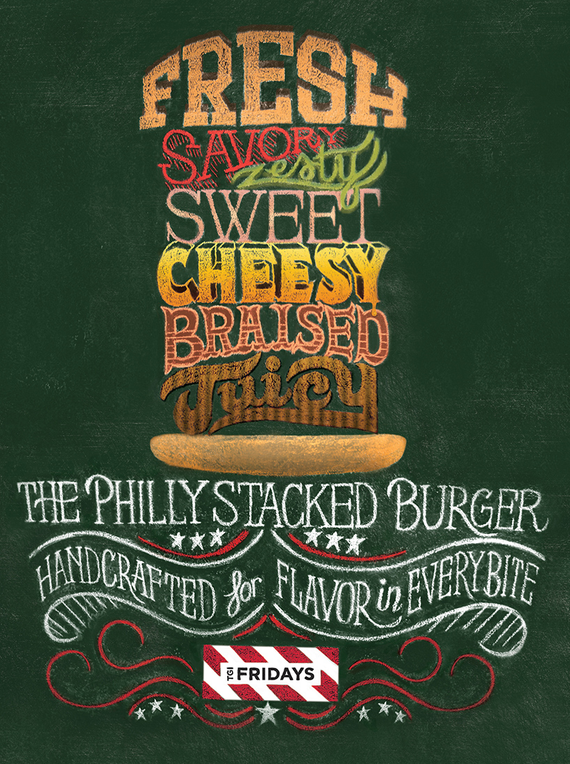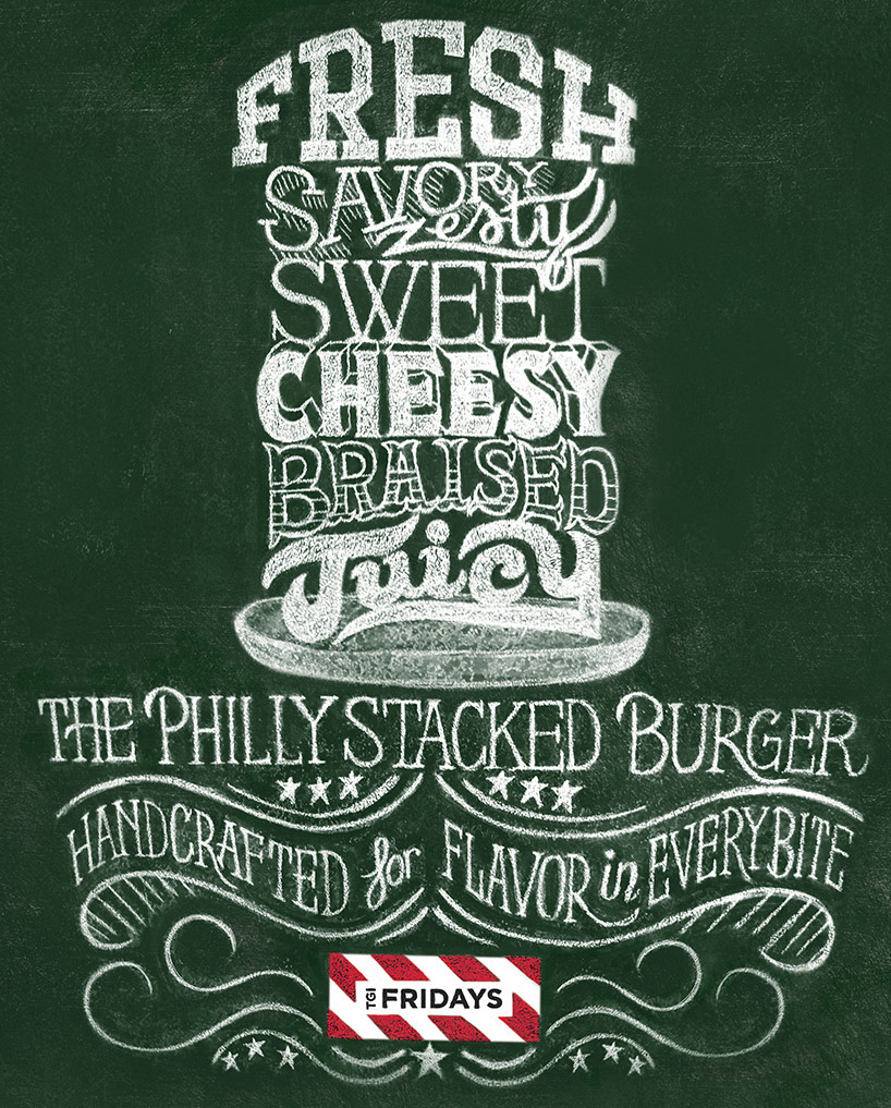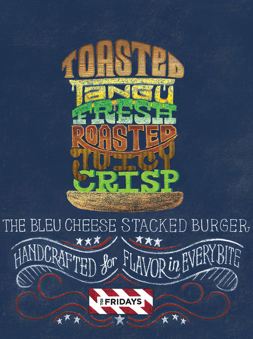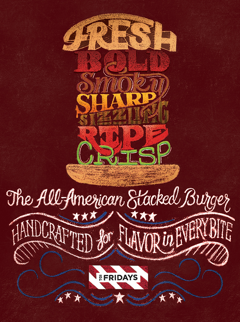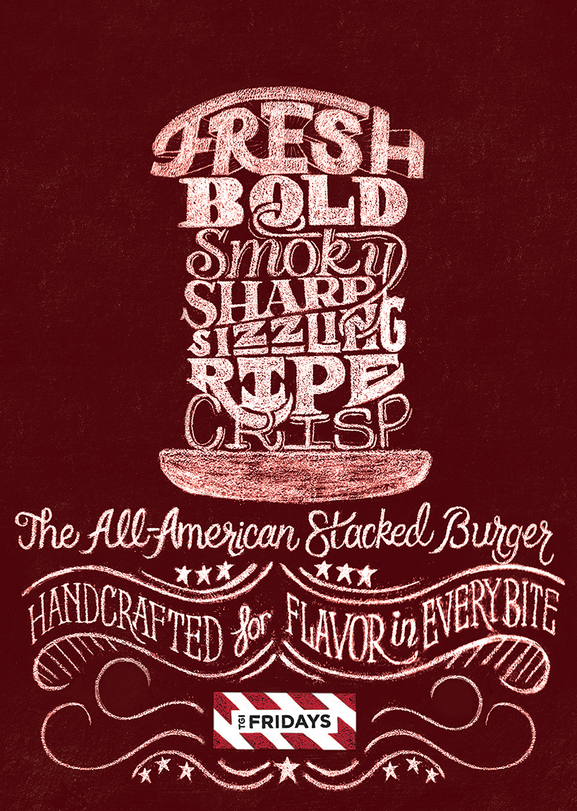
For TGI Fridays' launch of several new burgers, illustrator Scott Biersack has created these typographic chalk drawing ads. Each drawing gives character to the burger being presented and the letter forms even take on the properties of each ingredient. Chalk became the chosen medium in order to portray the delicate and hand-made nature of the burgers that TGI Fridays wishes to convey.
Showing posts with label Ad. Show all posts
Saturday, October 5, 2013
Tuesday, August 27, 2013
Stay Active... and Drink Coke?
Coca-Cola's brilliant new ad depicts the life of a man who is happy because he stays active and active because he stays happy (and because he takes time now and then to drink Coke, of course). The construction, execution, and precision of the many wooden puppets involved is incredible and a lot of fun to watch.
Wednesday, January 30, 2013
55 Years of the Brick
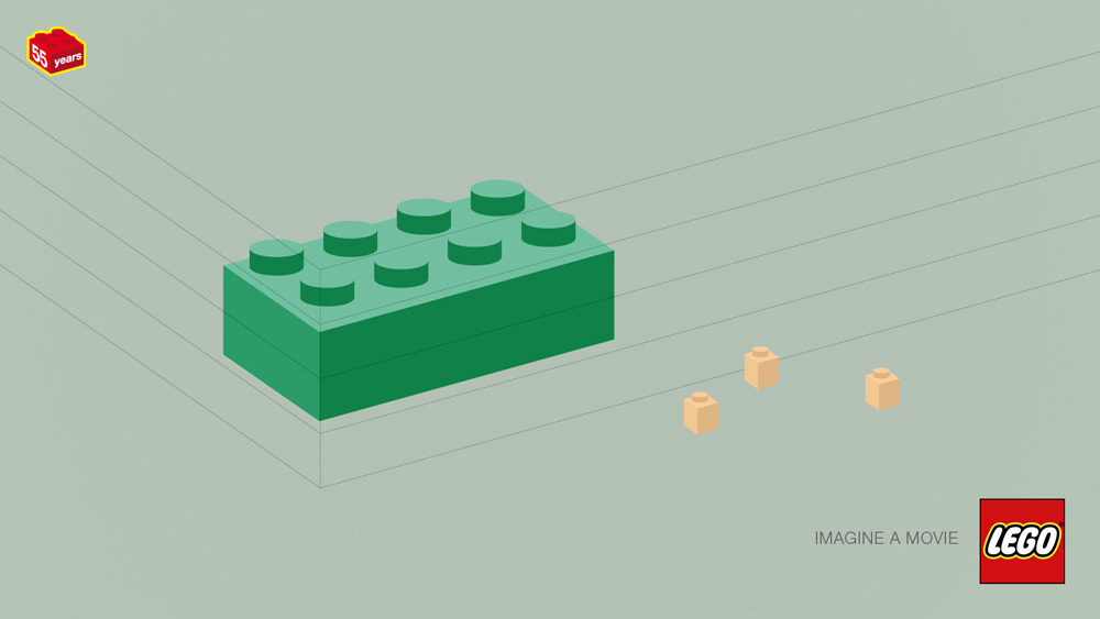
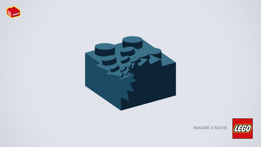
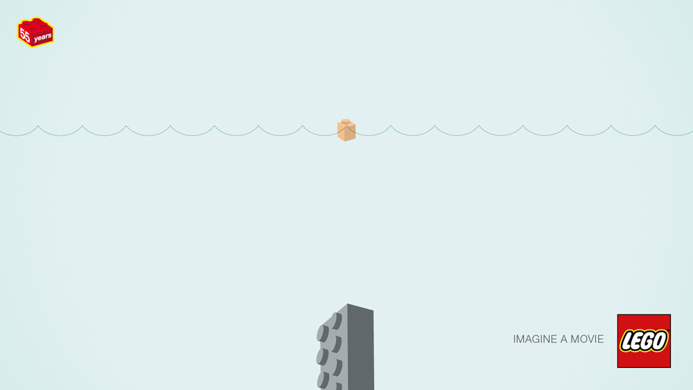
| Imagine a movie |
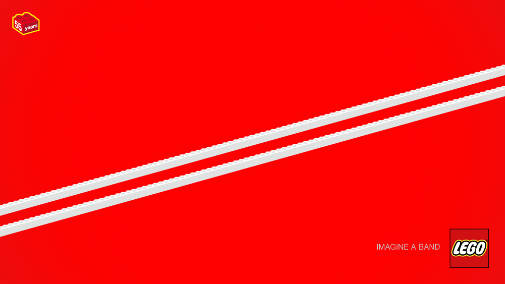
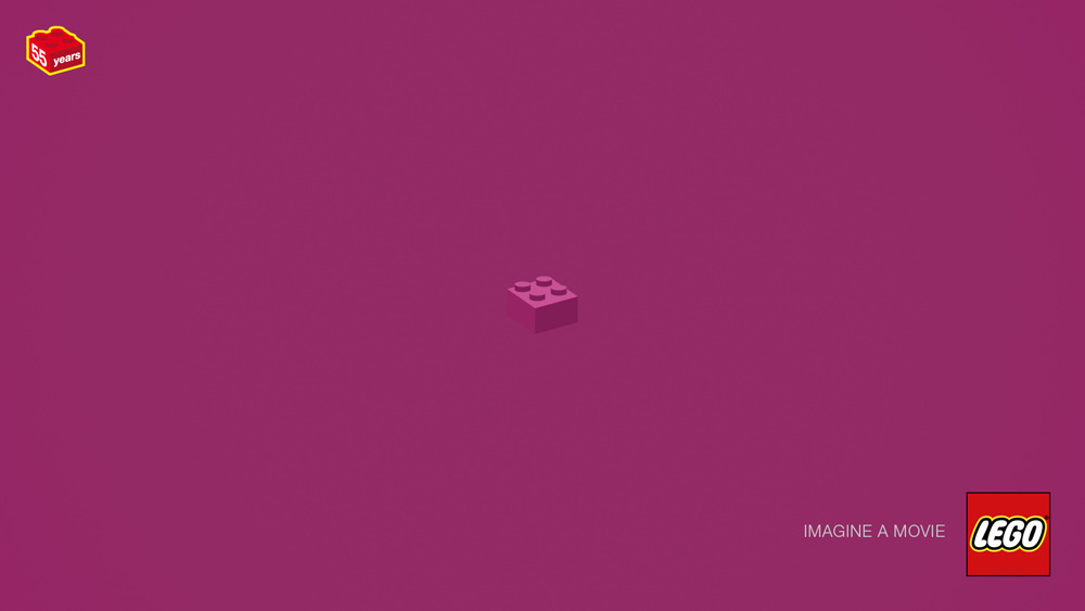
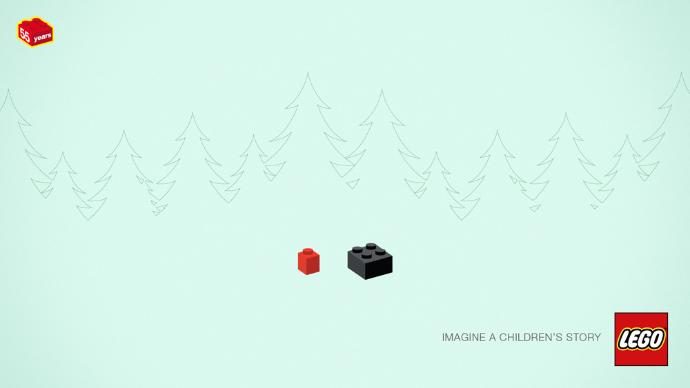
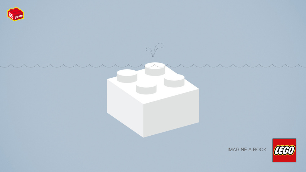
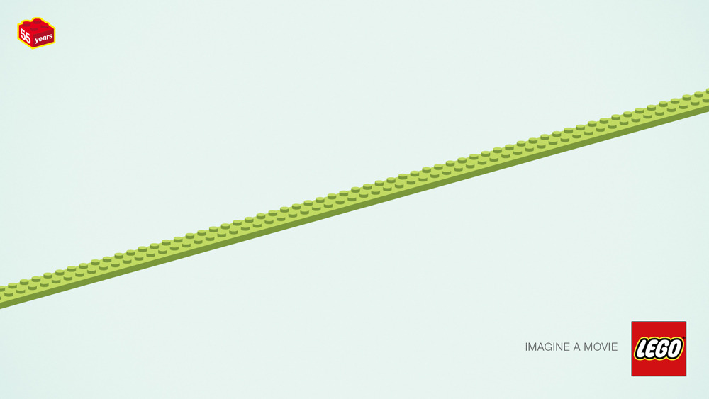
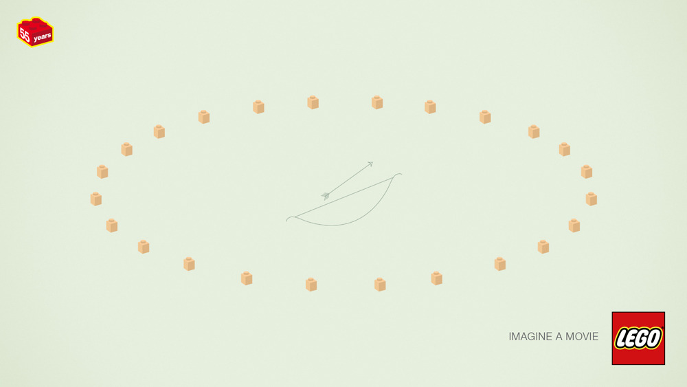
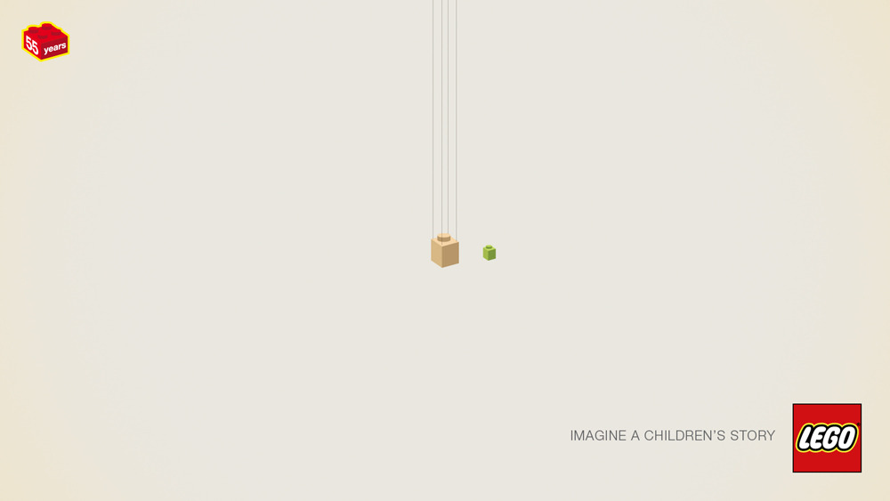
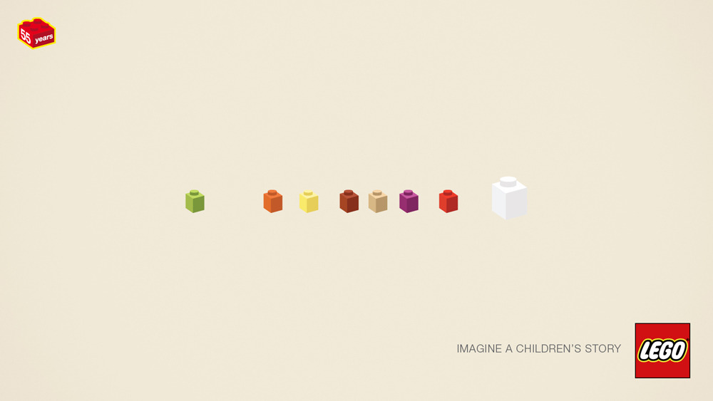
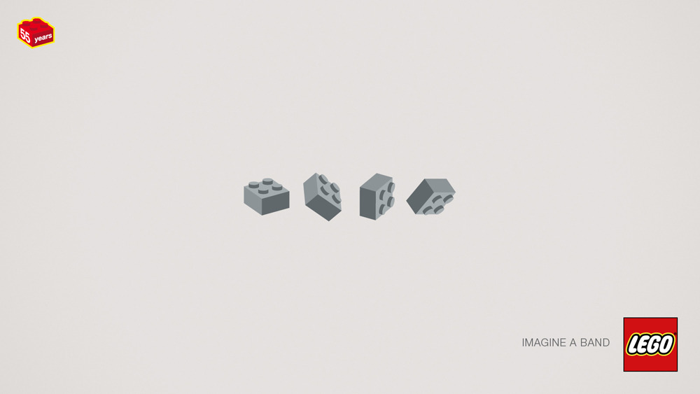
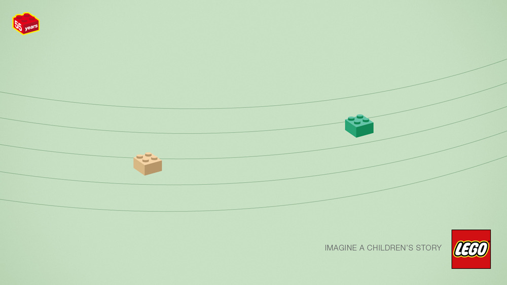
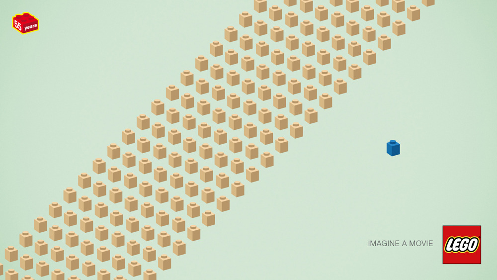
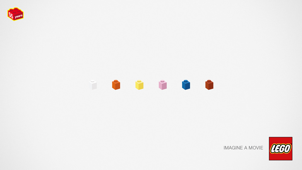
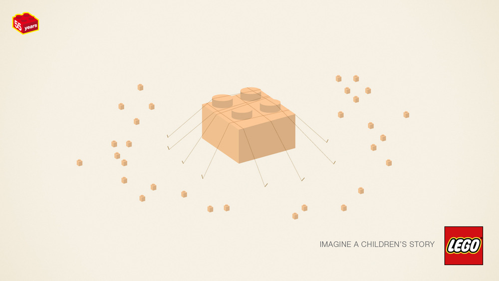
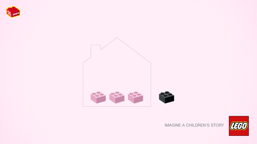
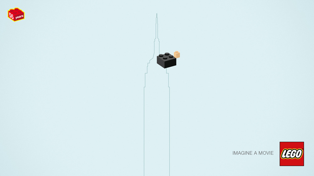
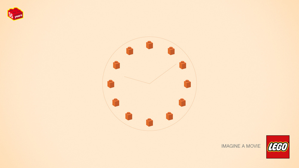
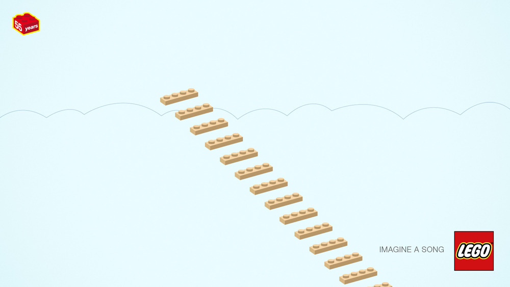
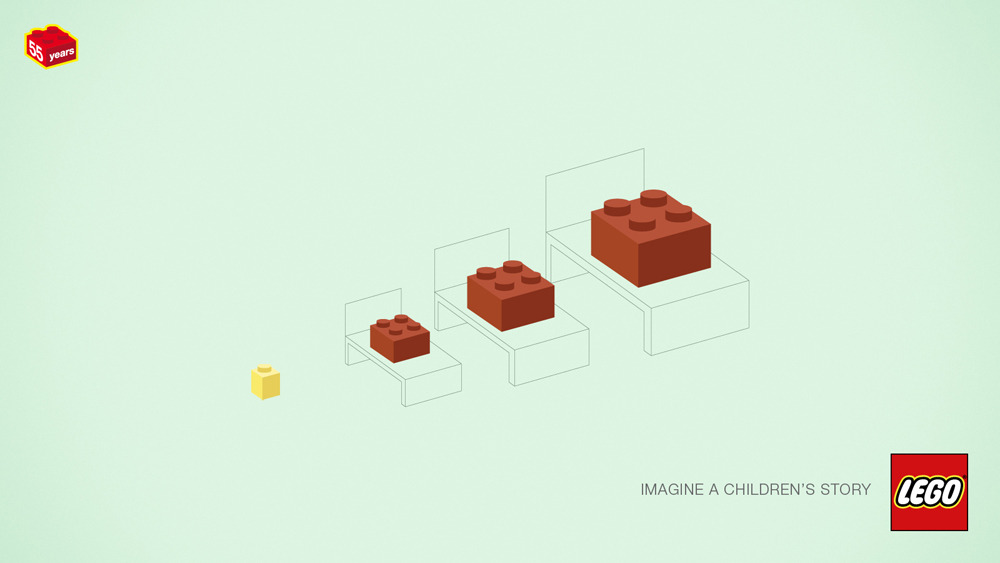
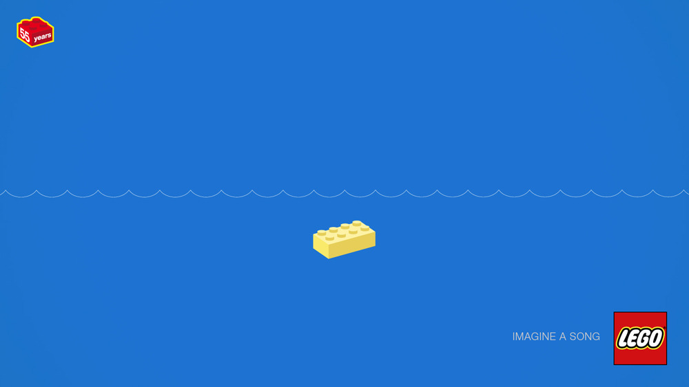
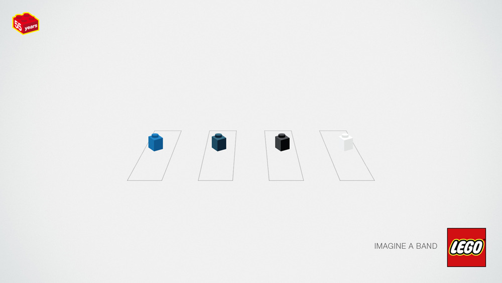
Here's some more awesomeness in the form of minimalistic Lego advertising (I previously posted another great set of Lego ads here). This time, Lego is celebrating 55 Years of the Brick by releasing these fun ads depicting movies, books, stories, bands, and songs using as few Lego pieces as possible. Try to figure them all out.
| Imagine a band |
| Imagine a movie |
| Imagine a movie |
| Imagine a children's story |
| Imagine a book |
| Imagine a movie |
| Imagine a book/movie |
| Imagine a children's story |
| Imagine a children's story |
| Imagine a band |
| Imagine a children's story |
| Imagine a movie |
| Imagine a movie |
| Imagine a movie |
| Imagine a story |
| Imagine a movie |
| Imagine a children's story |
| Imagine a movie |
| Imagine a movie |
| Imagine a song |
| Imagine a children's story |
| Imagine a song |
| Imagine a band |
Even more can be found on the Tumblr page linked below.
Monday, September 3, 2012
Nostalgia: Lego Ads
I totally did the airplane thing.
Tuesday, August 7, 2012
Beer of Summer
Not only is House of Shandy's new (and first) beer the perfect summer shandy, but it is also a cool and quirky design. Take a look here at the label and some other materials... and get some Curious Traveler before the summer's over!
![]() |
| Promotional material |
![]() |
| Traveler Taps |
![]() |
| House of Shandy Logo |
Tenacious Traveler will be House of Shandy's second "refresher" coming out in a few months. Like Curious, Tenacious Traveler will be brewed with lemon peel, but will also include honey and ginger.
While I'm at it, here are a few recent released (within the past year or so) Samuel Adams brand IPAs whose labels include some fun and personality-filled illustrations.
Labels:
Ad,
Beer,
Branding,
Identity,
Illustration,
Logo,
Typography
Tuesday, September 13, 2011
Color Study
![]() |
| Sea Foam Green |
![]() |
| Pine Green |
![]() |
| Olive Green |
![]() |
| Emerald Green and Brick Red |
![]() |
| Jungle Green and Mint Green |
![]() |
| Easter Grass Aqua and Sherbet Pink |
![]() |
| Wicked Witch Green, Moss Green and Asparagus Green |
![]() |
| Plastic X-mas Tree Green, Stop Sign Red and Caution Yellow |
![]() |
| Dark Forest Green, Tic Tac Orange and Steely Green |
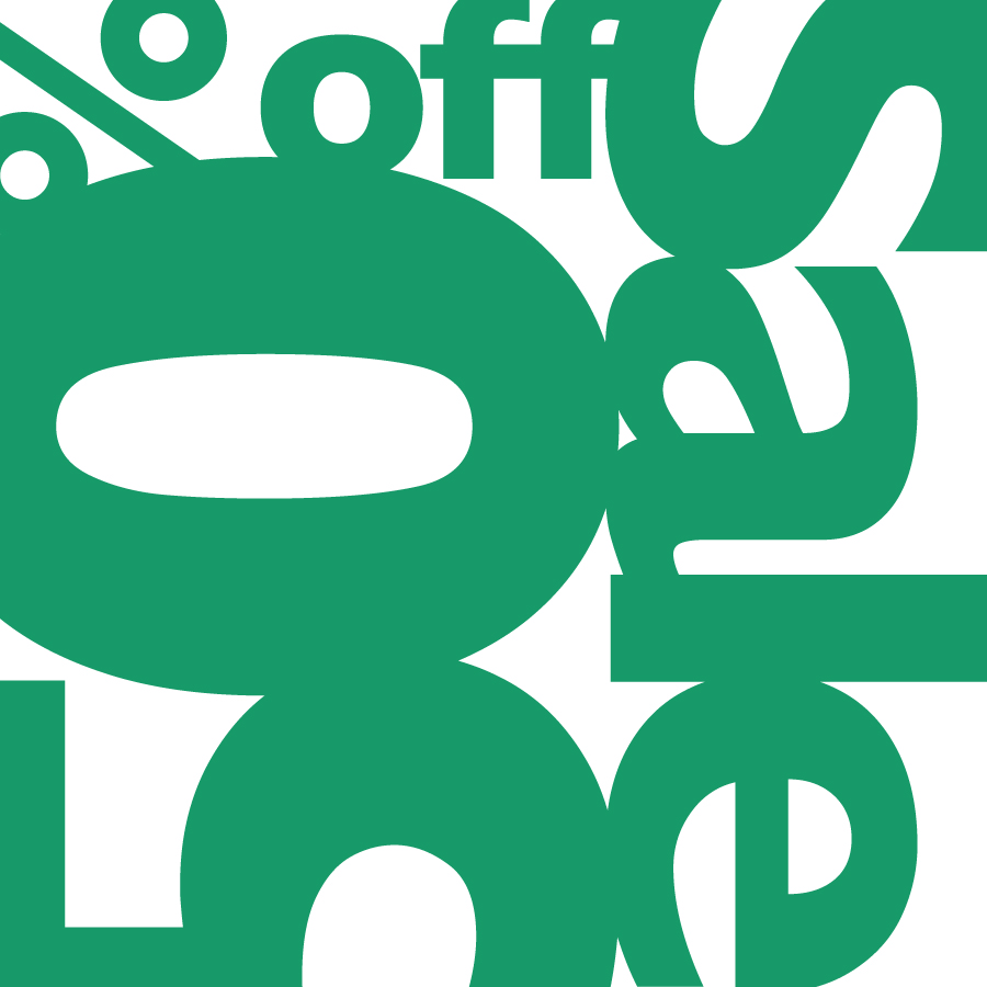
I chose green as my main focus for this assignment. I've always thought of green as a cool, calming color. It is often associated with nature and the environment. This relation became especially apparent when I looked at all the shades of green and kept thinking of different leafy plants, trees, and vegetables.
With such a strong connection to nature, I noticed the different greens evoking the feeling of different seasons. The first panel of Sea Foam Green makes me think of vibrant new life in plants or the ocean, making the ad look like its for either a Spring or Summer sale. The olive green looks more like a leaf getting ready to turn yellow or orange, appropriate for Autumn. Emerald Green and Brick Red together may make the viewer think of Christmas and the Aqua and Pink may be for Easter/Spring.
Figure/Ground was most notably triggered by colors of similar value, as seen in the Aqua and Pink ad. Those colors next to each other make for a strong vibration that makes the eye question which shapes are negative and which are positive. This also occurs for the Red, Green, Yellow and White ad between the Red and Green. In that same ad, there is also noticeable figure/ground around the word "Sale" due to the darker primary colors contrasting the lighter white.
As the color combinations became increasingly more complex, it became easier to identify what kind of ad each one could be. The associations with things like Spring, Christmas, Back-to-School and Clothing became clearer when there were more colors present. Other factors included how much of certain colors was used and the shades of those colors.
Subscribe to:
Posts (Atom)