Sunday, December 18, 2011

Our Bloodstained Roof


Ryan Andrews has some fantastically beautiful comics on his site. One such comic is "Our Bloodstained Roof." The story feels raw and real (whether it actually is or not) and has quirky, yet sophisticated illustrations, eye-catching textures, and dynamic accents of color. Definitely worth a look for some excellent storytelling.

View the full comic here: Our Bloodstained Roof

Monday, December 12, 2011

Design Anatomy App

Click for interactive iPad app
The Design Anatomy app treats design as if it were the subject of an anatomical study. Themes of layering, dissecting, and diagraming continue throughout to give this effect. Since the content is more observational than informational, the app is intended for people (most likely students) who are familiar with design and its principles, but would like different perspectives and inspirations.

Scale Page
Content and graphics are positioned and designed to lead the viewer down the app's vertical layout. Flowing lines navigate through the content, starting on the launch screen and ending on the last page. Lines and images bleed from page to page, making the user curious about about the rest that cannot be seen until the next page comes up. Dotted lines also guide the user to buttons that are linked to outside websites for additional information.

Layers page
The layout is made up of a four column grid, which allows for a nice variety of options for organizing content. In cases where image is most important, the content is able to take up multiple columns, but there could still be room for text about the work (see Texture, Voice, and Craft). If pieces of content are of equal importance, the even number of columns allows for an appropriate layout (see Layers and Hierarchy).

Craft page
The typeface used is Garamond. Its form compliments the fluid elegance of the navigation lines and opening image (the Bride of Frankenstein). It also has a textbook formality that works nicely with the theme of an anatomy study. Kerning is kept tight in the titles to create fascinating shapes, connections, or fluidity among the letters. This encourages users to study the typography's interesting forms.

(Design Anatomy app)

Sunday, December 4, 2011

Kinetic Typography: Language

This is a fantastic kinetic typography animation depicting a speech about language by the always intelligent and witty Stephen Fry.


I have to say I agree that people too often get hung up on the technicalities of the English language's structure. Where's the enjoyment in that? Words can be just as much an artistic medium as anything else and I love this animation's exploration of that idea.

Sunday, November 27, 2011

Sister Corita Kent

via Whitney Museum
After leaving her life as a nun in California, Corita Kent settled into Boston as a full-time artist. It was here that my great aunt actually met Corita and corresponded with her on a number of occasions. When talking about Corita, my aunt is always sure to mention that the former sister was quiet, modest, and, most notably, incredibly spiritual.

Signed notes to my great aunt (Eleanor) from Corita

In the Facisimle Magazine interview linked below, Corita confessed that she, ironically, had more time for her faith and religion after leaving her order of Sisters. While that life serves as the perfect form to express faith for many, it seems that Corita discovered that pursuing the life of an artist allowed for her to express her faith in the visual way she needed to.


The way in which Corita would integrate her spirituality into modern day observations is playful. With bright colors, familiar forms, and organic script, pieces like the Sunkist print above are very approachable. The scriptural content is given new context and makes the viewer contemplate the verse in a new way, one that relates to today, rather than thousands of years ago. 

Having spent a lot of time in Catholic schools growing up, I know that it can become dull and repetitive to keep seeing the same, tired depictions of religion that often only seem to relate to the time of Jesus and his Apostles. While flipping through religion text books, or sitting in church, it would have been much more engaging to see scripture in the expressive, modern, and visually relevant iterations of Corita.


In the Facsimile interview, Corita described her work as a visualization of the way words are spoken. The type always looks to be crafted by human hand and not machine. They have personality and through their form, color and juxtaposition, set mood, inflection, and feeling. Corita visualized humans' emotional connection with words and, in doing so, created wonderful pieces that have strong resonance with viewers.

Sunday, November 13, 2011

Superhydrophobic Spray


This was too cool to pass up... partially because its super awesome science in action, but mostly because I love watching the part where chocolate syrup just shoots off of this shoe (magic!). Anyway, this video showcases the abilities of a superhydrophobic spray developed by Ross Nanotechnology that would allow you to jump into a pool fully dressed and come out already wearing dry clothes... y'know, in case you ever wanted to do that.

(via Geekologie)

Friday, November 4, 2011

Image: Mondo Posters

The Bride of Frankenstein
Mondo Tees gets a lot of poster commissions for films being re-released into theaters. It's no wonder why. Their work is awesome. The illustrations include imagery that immediately gives the feel of the film that also brings about a strong sense of nostalgia. I highly recommend browsing their gallery.

Return of the Jedi

The Invisible Man

The Iron Giant

Rocky
The Saul Bass-like minimalist design for this Rocky poster is absolutely brilliant. Just putting that out there.

A Nightmare on Elm Street

(via Mondo)

Wednesday, November 2, 2011

The 10th Amendment

"The powers not delegated to the United States by the Constitution, nor prohibited by it to the States, are reserved to the States respectively, or to the people."

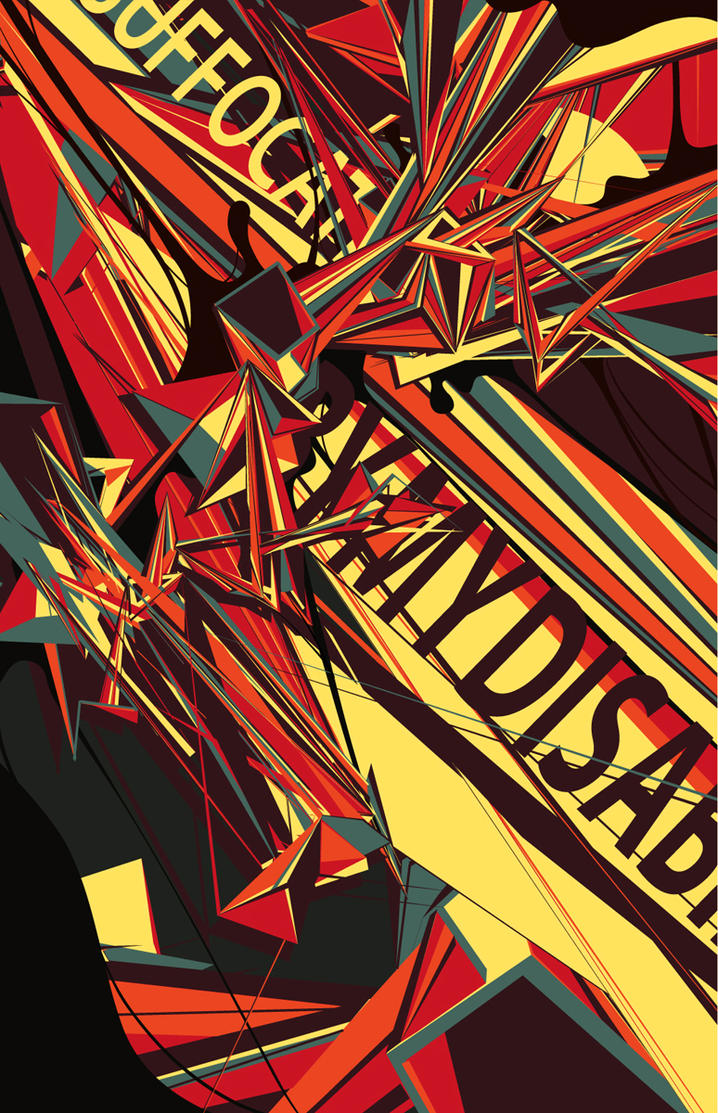
When choosing colors for this project, I wanted combinations that would be powerful, leading me to colors that contrasted or complimented each other. I ended up with a dark purple and yellow because, as compliments, they evoke energy from the way they interact. Yellow is also associated with electricity and the sun, which are both linked to power. The typeface is Rockwell, because it is structural and bold. This relates well since I imagine the 10th amendment to be a last effort of the founding fathers to install structure between powers of the federal government and powers of the states.

Extreme scale differences
In the first poster, I used the extreme scale to visualize a two-word chant like one might hear at a football game. Here is where I started to realize that the colors look like school colors and the type looks like college logo lettering. Each state has its own sports teams that compete to show who is the best (or who has the most powerful team/state). Here, the amendment takes on the role of a cheerleader or fan giving the states motivation and power of their own.

Minimal scale differences
With minimal shift in scale, I relied more heavily on repetition to convey the amendment's message. Here, the wording of the 10th Amendment makes up the United States, but the words "states" and "powers" are bolded and yellow. They stick out, making their repetition more evident to emphasize that there are multiple states within this country that each have their own rights.

Use of image
With imagery now to work with, I decided to take some very recognizable shapes and put them into a ridiculous situation. The states can read as superheroes, rockets, or jets all of which act as symbols of power. 

I think all three flyers work in different ways, but the one that is most successful is the third, image-based flyer. With images, this flyer has an extra element to help it out. It includes very recognizable shapes (states) and illustrative elements in the form of jet vapor trails. Seeing the states immediately keys the viewer in on what is the subject. This in conjunction with what the states are doing (flying, rocketing upward) makes it clear that there is a positive message related to the states having some special abilities. The highlighted words ("states" and "powers") reinforce the message as a secondary element.

Tuesday, November 1, 2011

Hierarchy: Posters

Here are a couple of fantastic posters I found that make use of strong hierarchy.

Ayn Rand's "Anthem" by Kevin Tong

The first is a print based on the Ayn Rand novella Anthem. The story takes place in a dystopia where individualism is erased from society (using the word "I" is a capital offense). The imagery here sets up the mood perfectly, having the emotionless group taking up most of the poster's upper space while the lone individual stands at the bottom, almost a speck in comparison. The title takes prominence (perhaps just after the crowd image) at the top while Rand's name (that of an individual, keeping with the theme) is minuscule at the very bottom of the hierarchy. 

Iron & White spring tour by DKNG Studios

This music tour poster makes what is most important very prominent, like the center of a bullseye. Secondary information becomes part of the radiating-from-center image, making your eye travel outward, taking in more and more until it finds the passing train at the bottom.

&

Wednesday, October 26, 2011

Impressive and Fun Animation

For a recent project based around Saul Bass, I've been really getting into animated opening sequences for movies and stumbled across this. Its a fan-made animation for the upcoming The Adventures of Tintin. Its so good in fact that Steven Spielberg has actually offered creator James Curran a job on a future film... There you are. The powers of the internet.


Texture from Type

Photographed texture

Texture recreated using only type

Description of the original texture: "The soft texture is made up of many grid-like, rectangular bumps, similar to kernels of corn on the cob. Each bump is made up of dozens of small threads that create a nap to the texture. Running a hand down the nap feels smooth and velvety. Running a hand up the nap creates a little more resistance and a fuzzy surface like the coat of a short-haired dog. Then, each thread is more noticeable as they brush against skin."

In recreating the texture with only type, I used 25 layers in Illustrator. Garamond works well with its serifs occasionally reading as loose bits of thread sticking out of the fabric. The typeface's humanist strokes of subtly varying widths and angled serifs and strokes helps to portray the looseness of fabric. A sans-serif, slab-serif, or even modern typeface may have been too machined, rigid, or structured to give off the feeling of fabric.

Type has the potential to do a surprisingly large amount of what photographic images can do. It can communicate depth, texture, space, color, lighting, etc. With enough type and enough painstakingly long hours upon hours upon days upon weeks... I don't see why type couldn't finally achieve the photorealism of a photograph. The only problem is that the computer might explode before that point.

Sunday, October 23, 2011

Scale: Giant Sculptures


It must be very impressive (and possibly intimidating) to stand in front of these sculptures of objects and people in larger-than-life scales. I think their largeness is exaggerated further by the fact that each of the sculptures are modeled after subjects that viewers recognize and are used to seeing at a certain, smaller scale.


Tuesday, October 18, 2011

Conceptual Earthscraper


These are some designs and models of a conceptual earthscraper, an upside-down skyscraper. Its purpose is to offer additional work and living space in the center of Mexico City without hogging up the skyline. Needless to say: it's an insanely cool idea. The areas of space from top to bottom would go Aztec museum (first ten floors), retail,  apartments and then businesses. Now, the glass floor (see also: ceiling) is made to allow light from the outside to filter throughout the structure, but somehow I doubt those businesses at the bottom are getting much sunlight. I think I'll stick to living and working aboveground, thanks. The museum and retail spaces, on the other hand, do look like they'd make for a fantastic tourist attraction. For now, though, its only a concept.


Yes, the glass is designed to be walked on. Not good for those afraid of heights... or of falling the 50+ stories below. I hope its sturdy.


Sunday, October 16, 2011

Type: more from Axel Peemoeller


When I was looking at Axel Peemoeller's awesome parking garage way-finding, I noticed some more interesting work with type. Above is some cool type made from what appears to be torn paper. Below are some magazine ads for cars. They're a bit creepy as well, but I'm fascinated with how the letterforms interact with their environments.


&

Texture


Friday, October 14, 2011

Navigation: Axel Peemoeller

This way-finding design in a Melbourne parking garage clearly states where you should be going and yet, just thinking about all the thought process that went into its creation is absolutely mind-boggling.