Sunday, November 27, 2011

Sister Corita Kent

via Whitney Museum
After leaving her life as a nun in California, Corita Kent settled into Boston as a full-time artist. It was here that my great aunt actually met Corita and corresponded with her on a number of occasions. When talking about Corita, my aunt is always sure to mention that the former sister was quiet, modest, and, most notably, incredibly spiritual.

Signed notes to my great aunt (Eleanor) from Corita

In the Facisimle Magazine interview linked below, Corita confessed that she, ironically, had more time for her faith and religion after leaving her order of Sisters. While that life serves as the perfect form to express faith for many, it seems that Corita discovered that pursuing the life of an artist allowed for her to express her faith in the visual way she needed to.


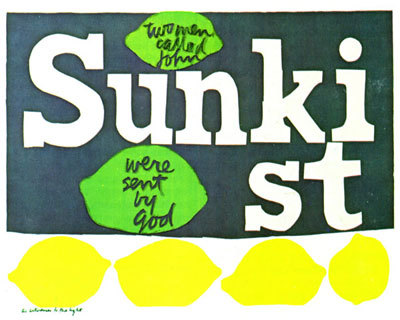
The way in which Corita would integrate her spirituality into modern day observations is playful. With bright colors, familiar forms, and organic script, pieces like the Sunkist print above are very approachable. The scriptural content is given new context and makes the viewer contemplate the verse in a new way, one that relates to today, rather than thousands of years ago. 

Having spent a lot of time in Catholic schools growing up, I know that it can become dull and repetitive to keep seeing the same, tired depictions of religion that often only seem to relate to the time of Jesus and his Apostles. While flipping through religion text books, or sitting in church, it would have been much more engaging to see scripture in the expressive, modern, and visually relevant iterations of Corita.


In the Facsimile interview, Corita described her work as a visualization of the way words are spoken. The type always looks to be crafted by human hand and not machine. They have personality and through their form, color and juxtaposition, set mood, inflection, and feeling. Corita visualized humans' emotional connection with words and, in doing so, created wonderful pieces that have strong resonance with viewers.

Sunday, November 13, 2011

Superhydrophobic Spray


This was too cool to pass up... partially because its super awesome science in action, but mostly because I love watching the part where chocolate syrup just shoots off of this shoe (magic!). Anyway, this video showcases the abilities of a superhydrophobic spray developed by Ross Nanotechnology that would allow you to jump into a pool fully dressed and come out already wearing dry clothes... y'know, in case you ever wanted to do that.

(via Geekologie)

Friday, November 4, 2011

Image: Mondo Posters

The Bride of Frankenstein
Mondo Tees gets a lot of poster commissions for films being re-released into theaters. It's no wonder why. Their work is awesome. The illustrations include imagery that immediately gives the feel of the film that also brings about a strong sense of nostalgia. I highly recommend browsing their gallery.

Return of the Jedi

The Invisible Man

The Iron Giant

Rocky
The Saul Bass-like minimalist design for this Rocky poster is absolutely brilliant. Just putting that out there.

A Nightmare on Elm Street

(via Mondo)

Wednesday, November 2, 2011

The 10th Amendment

"The powers not delegated to the United States by the Constitution, nor prohibited by it to the States, are reserved to the States respectively, or to the people."

When choosing colors for this project, I wanted combinations that would be powerful, leading me to colors that contrasted or complimented each other. I ended up with a dark purple and yellow because, as compliments, they evoke energy from the way they interact. Yellow is also associated with electricity and the sun, which are both linked to power. The typeface is Rockwell, because it is structural and bold. This relates well since I imagine the 10th amendment to be a last effort of the founding fathers to install structure between powers of the federal government and powers of the states.

Extreme scale differences
In the first poster, I used the extreme scale to visualize a two-word chant like one might hear at a football game. Here is where I started to realize that the colors look like school colors and the type looks like college logo lettering. Each state has its own sports teams that compete to show who is the best (or who has the most powerful team/state). Here, the amendment takes on the role of a cheerleader or fan giving the states motivation and power of their own.

Minimal scale differences
With minimal shift in scale, I relied more heavily on repetition to convey the amendment's message. Here, the wording of the 10th Amendment makes up the United States, but the words "states" and "powers" are bolded and yellow. They stick out, making their repetition more evident to emphasize that there are multiple states within this country that each have their own rights.

Use of image
With imagery now to work with, I decided to take some very recognizable shapes and put them into a ridiculous situation. The states can read as superheroes, rockets, or jets all of which act as symbols of power. 

I think all three flyers work in different ways, but the one that is most successful is the third, image-based flyer. With images, this flyer has an extra element to help it out. It includes very recognizable shapes (states) and illustrative elements in the form of jet vapor trails. Seeing the states immediately keys the viewer in on what is the subject. This in conjunction with what the states are doing (flying, rocketing upward) makes it clear that there is a positive message related to the states having some special abilities. The highlighted words ("states" and "powers") reinforce the message as a secondary element.

Tuesday, November 1, 2011

Hierarchy: Posters

Here are a couple of fantastic posters I found that make use of strong hierarchy.

Ayn Rand's "Anthem" by Kevin Tong

The first is a print based on the Ayn Rand novella Anthem. The story takes place in a dystopia where individualism is erased from society (using the word "I" is a capital offense). The imagery here sets up the mood perfectly, having the emotionless group taking up most of the poster's upper space while the lone individual stands at the bottom, almost a speck in comparison. The title takes prominence (perhaps just after the crowd image) at the top while Rand's name (that of an individual, keeping with the theme) is minuscule at the very bottom of the hierarchy. 

Iron & White spring tour by DKNG Studios

This music tour poster makes what is most important very prominent, like the center of a bullseye. Secondary information becomes part of the radiating-from-center image, making your eye travel outward, taking in more and more until it finds the passing train at the bottom.

&