Wednesday, September 28, 2011

Craft Project


From a mysterious slot in the white void slides a black ball. After that, another and another until there is a continuous appearance of the dark objects falling swiftly to the ground. Upon impact, each ball will shatter into hundreds of smaller balls, most of which will collect at the bottom of the space. Only a few will break away and be flung high enough to reach the top.

In choosing between lines and points as my medium, I decided to go with what I thought could communicate more weight. Sure, a line could have fallen and then broken into a lot of little lines in my story, but the ball shape allowed for the breaking point to be much more explosive. The pieces could fly, bounce, and roll every which way. I didn't think a line could communicate that as effectively.

The photographs have made the story much more dramatic. The first photo, being out-of-focus, makes the origin of the circles mysterious. Bright lighting on certain parts of the box create a great contrast to the dark shadows, making the story more intense. Intensity is also added by angles that are never straight-on views. The balls are falling to their demise. But, in the fifth panel, the small pieces fly up into brightness. The last photo shows a few of those pieces in another out-of-focus shot, suggesting that they are now in an ethereal, possibly happy state.

Craft: Book Sculptures

Check out these amazing book sculptures.


For these and more, check out Sepientia.

Sunday, September 25, 2011

Emotion Grid: Relief

The emotion I chose to illustrate was relief. The colors involved in this story are blue (blue-green spectrum), red, and black. I think of relief as being like a wave. It sweeps over you and washes away any feelings of despair or anxiety. Here, the calming, cool blues and greens are the relief rushing in to overcome the darkness and twinges of discomfort represented by accents of red. 


In the planning stages of this project, the design was more chaotic with colors that didn't necessarily relate to one another. That element of contrast still exists in the final product with the bright blues directly battling the dark blacks. The difference is that now, the blue/green colors act together more cohesively as one moving force that evolves from one part of the plane to the other. The hues of the cool colors become brighter and more intense as they move from the bottom left toward the top right to show a growing strength in the emotion that it will need to overcome the negative feelings.


Language and type gave the color story additional meaning due to the contextual nature of words and letterforms. Words have meaning behind them and evoke emotions from the reader, whether consciously or not. Words like hope, cascading, and rebirth have light and refreshing conations that are necessary to convey relief. Likewise, typefaces are also able to communicate through their forms. I chose Optima to help me display relief because, as a humanist typeface, it is has an organic feel. The strokes do not looked machined and vary, calling to mind the way a person might write with ink. This organic flow within the letterforms aided the look of a naturally cascading and evolving form.

Through both parts of the project, grid played a huge role. In part 1, it required me to think about the placement of images very carefully. Relationships between images were completely different depending on where they were placed. The grid played an even bigger role in part 2, even though the appearance of the grid is much subtler here. I was able to place certain letterforms in the correct places and get just the right accents of color by referencing the first image grid. This also showed me where the meeting of the blue and black forms was so that I could communicate it in the type grid. Due to the open spaces between the words and letters, that meeting place was translated into white space to act as a more defined area.

Wednesday, September 21, 2011

Transparent Animals

Iori Tomita via Geekologie

Why dissect an animal when you can just look through its skin? Iori Tomita of Japan has founded New World Transparent Specimens, a project that he hopes will bring the fields of Science, Art, and Philosophy together. 

The dying technique used by Tomita is usually reserved for purely scientific reasons, such as the examination of skeletal and biological systems. He makes sure to inject different colors into different areas of the creatures' anatomies in order to accurately display the makeups. Bright red dye is injected into harder bones while blue dye is injected into softer cartilage. To get the flesh see-through, Tomita uses an enzyme designed to dissolve the skin's natural proteins. The end result is kept in a jar of glycerin and is ready for viewing. 

While many of the larger specimens are kept in exhibits, they are still often for sale (although, they are very expensive). Smaller, more affordable versions can be purchased in certain Japanese department stores.

Iori Tomita via Geekologie

Thursday, September 15, 2011

Grid: Andy Gilmore

Works by Andy Gilmore relevant to my next class project. Gilmore most recently made the first piece here for Wallpaper Magazine to display the color palettes of clothing designers in 2011. Cool stuff.


Tuesday, September 13, 2011

Color Study

Sea Foam Green

Pine Green

Olive Green

Emerald Green and Brick Red

Jungle Green and Mint Green

Easter Grass Aqua and Sherbet Pink

Wicked Witch Green, Moss Green and Asparagus Green

Plastic X-mas Tree Green, Stop Sign Red and Caution Yellow

Dark Forest Green, Tic Tac Orange and Steely Green

I chose green as my main focus for this assignment. I've always thought of green as a cool, calming color. It is often associated with nature and the environment. This relation became especially apparent when I looked at all the shades of green and kept thinking of different leafy plants, trees, and vegetables.

With such a strong connection to nature, I noticed the different greens evoking the feeling of different seasons. The first panel of Sea Foam Green makes me think of vibrant new life in plants or the ocean, making the ad look like its for either a Spring or Summer sale. The olive green looks more like a leaf getting ready to turn yellow or orange, appropriate for Autumn. Emerald Green and Brick Red together may make the viewer think of Christmas and the Aqua and Pink may be for Easter/Spring.

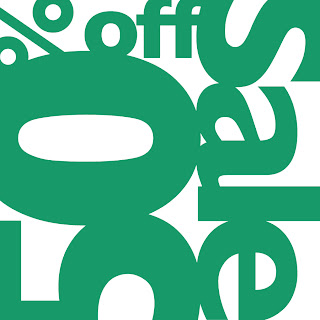
Figure/Ground was most notably triggered by colors of similar value, as seen in the Aqua and Pink ad. Those colors next to each other make for a strong vibration that makes the eye question which shapes are negative and which are positive. This also occurs for the Red, Green, Yellow and White ad between the Red and Green. In that same ad, there is also noticeable figure/ground around the word "Sale" due to the darker primary colors contrasting the lighter white.

As the color combinations became increasingly more complex, it became easier to identify what kind of ad each one could be. The associations with things like Spring, Christmas, Back-to-School and Clothing became clearer when there were more colors present. Other factors included how much of certain colors was used and the shades of those colors.

Thursday, September 8, 2011

Colors

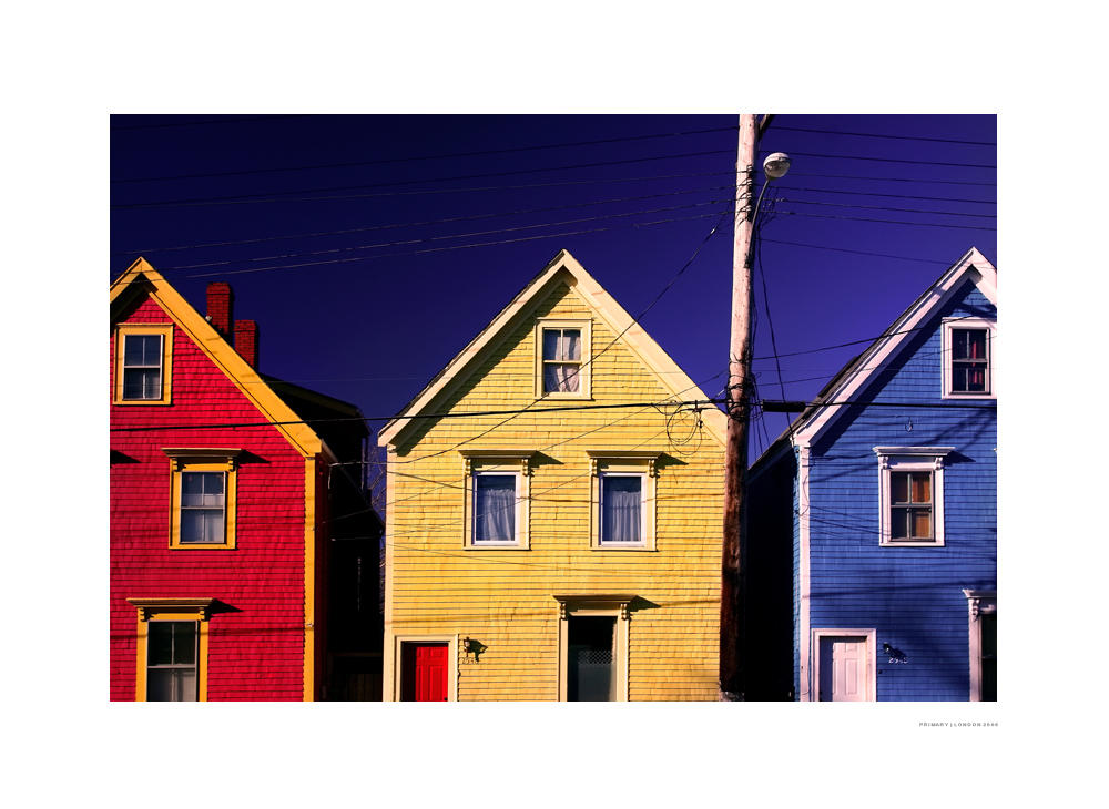
Let's start with our old friends, the primary colors. Red, Yellow, and Blue, the three colors that can be mixed to create all others (mostly).

londonxpress on Deviantart

This photo prominently features two secondary colors sitting next to each other (although, the orange appears more yellow after scanning). With the green grass and orange... orange, the only secondary color missing is purple. These are the colors created by mixing two primary colors together.

"Orange Feast" by Anna Gilliam, as published in The Bridge, Volume 3

This blue-green fish is an example of a tertiary color. A secondary color, green, and primary color, blue, are put together to become this tertiary mix.

Chuck Savall

This colored pencil drawing is a great example of complimentary colors at work. Compliments are opposites, or near opposites, on the color wheel; in this case, blue and orange. Being opposites, the colors create great contrast between the cool and warm colors.

"Still Life" by Corinne Corey, as published in The Bridge, Volume 7


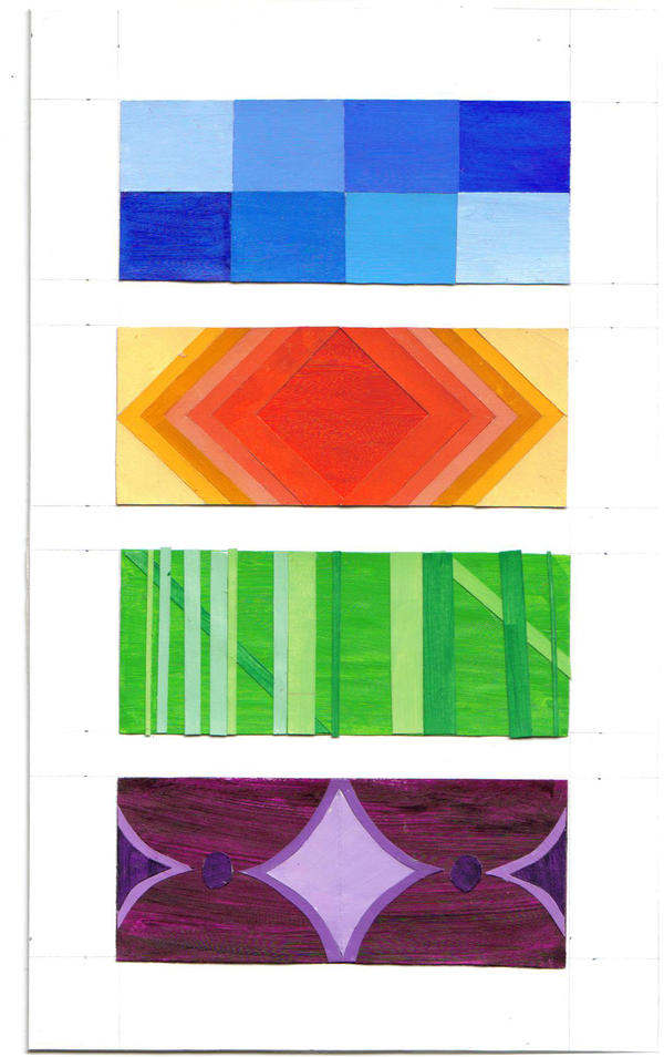
This color study shows a student's exercise involving analogous colors. These are colors that sit next to  (or close to) each other on the color wheel. The differences are usually minimal. Seen here are different shades of blue, shades of orange, red, and yellow, shades of green, and shades of purple.

wiqas-Momiji on Deviantart
In this paper mosaic, there are a few colors that can be picked out as shades of primary, secondary, or tertiary colors. There is yellow in the girl's hair, blue-greens in the background, a little burnt orange in the girl's neck, but there are also many other neutral colors not so easy to identify in this way. Many background panels look a bit beige, but may include some yellow, orange, or brown. There are peachy and brownish values within the girl's face, lips, and eyes. It is easier to refer to some of these as "skin-color," "peach-color," or "steel-color" rather than define them as a specific primary, secondary, or tertiary.

Netdog on Deviantart

Figure/Ground

These reversible figure/ground illusions come from The Ultimate Book of Optical Illusions by Al Seckel. This first one nearly drove me crazy. It is a great example of figure/ground since, as an illusion, it is designed to force the viewer to stare and really work at seeing the image. With so many floating, contrasting shapes, it becomes difficult to determine what is positive space and what is negative. After that "AHA" moment, you realize the two fields work together to suggest a man with a beard.


This next one's a little easier, with the arrows reminding me of the FedEx logo. Also note the complimentary colors. Its a nice two-for-one example.