
 |
| Sea Foam Green |
 |
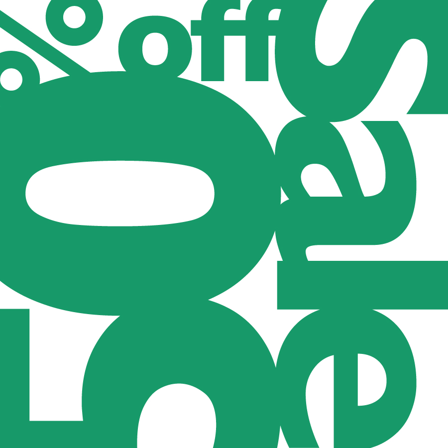
| Pine Green |
 |
| Olive Green |
 |
| Emerald Green and Brick Red |
 |
| Jungle Green and Mint Green |
 |
| Easter Grass Aqua and Sherbet Pink |
 |
| Wicked Witch Green, Moss Green and Asparagus Green |
 |
| Plastic X-mas Tree Green, Stop Sign Red and Caution Yellow |
 |
| Dark Forest Green, Tic Tac Orange and Steely Green |
I chose green as my main focus for this assignment. I've always thought of green as a cool, calming color. It is often associated with nature and the environment. This relation became especially apparent when I looked at all the shades of green and kept thinking of different leafy plants, trees, and vegetables.
With such a strong connection to nature, I noticed the different greens evoking the feeling of different seasons. The first panel of Sea Foam Green makes me think of vibrant new life in plants or the ocean, making the ad look like its for either a Spring or Summer sale. The olive green looks more like a leaf getting ready to turn yellow or orange, appropriate for Autumn. Emerald Green and Brick Red together may make the viewer think of Christmas and the Aqua and Pink may be for Easter/Spring.
Figure/Ground was most notably triggered by colors of similar value, as seen in the Aqua and Pink ad. Those colors next to each other make for a strong vibration that makes the eye question which shapes are negative and which are positive. This also occurs for the Red, Green, Yellow and White ad between the Red and Green. In that same ad, there is also noticeable figure/ground around the word "Sale" due to the darker primary colors contrasting the lighter white.
As the color combinations became increasingly more complex, it became easier to identify what kind of ad each one could be. The associations with things like Spring, Christmas, Back-to-School and Clothing became clearer when there were more colors present. Other factors included how much of certain colors was used and the shades of those colors.
No comments:
Post a Comment